It’s all about the user experience, right?
I am a sucker for a great website, app or software that lets me do what I need to do, simply.
I have been known to change carriers, companies, and online platforms because I don’t like fighting their site or digging for information. That’s why I use business tools like Xero, Gusto, Evernote, Google Drive, Trello, Slack. They have changed how we work and make it easy to use their products, and more importantly, do what we need to do. Even Salesforce has changed their look, making it easier to use and more contemporary.
We know LinkedIn is not the most beautiful or intuitive website or app out there. I’d like to see LinkedIn become easier to navigate. They do try, but it’s not an easy task. And, where and when they give, they take away. I haven’t seen a time where LinkedIn adds some great new feature and doesn’t remove something most of their members consider vital. I don’t get it, but somewhere I want to believe they have a good reason.
My Top 5 Distractions on LinkedIn
- Home Page: Videos that auto-play make me crazy, and there is always one at the top of my feed. When I am on LinkedIn, I am intent, working and networking, and I find that these videos derail me quickly.
Suggestion: Turn this Setting feature off: Go to your Settings and, on the Account tab, you can change this to “off.”

- The confusion over Publishing a Post versus Sharing an Update rages on and so I click less than ever. It’s important to understand how to use this feature since Publishing a Post is one of the best ways to use LinkedIn well. Here is a refresher on tips for original content, publishing and posting. You will be glad you re/reread this post.
Suggestion: Knowing what type of content to use and how to share, post and engage with content adds to your credibility.

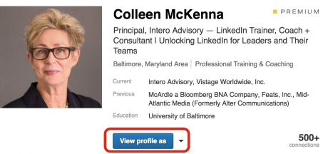
- When I look at my Profile, and I am by default in Edit Mode, and I can’t see my full Summary and Experience descriptions. I have to scroll up to the top of my profile and click the blue box “View Profile as” and then scroll to the top and see that it says “as a connection.”
I know it’s a little thing, but I would prefer to not always to be in edit mode.
Suggestion: When you want to review your profile, make sure you view yourself as a connection would see you.
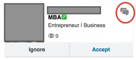
- When I am reviewing my pending invitations and if I click “Accept” before hovering over the thought bubble in the corner, I lose the opportunity to see if there was a message there. We all click too fast sometimes, and it’s easy to miss. The problem is that there could have been an interesting or important message from that person. At the very least, a personalized message that deserves to be acknowledged.
Suggestion: Click on the talk bubble first, it will help you decide whether this person is connecting randomly or is genuinely interested in connecting with you.
- We all meet a lot of people. I am, by nature, a kind of curious person. If I receive an invitation from someone that I don’t recognize and they haven’t personalized the message, my inclination is to see who they are. Guess what, though. So often, it’s a random message, and it can be a time waster. Why are people connecting? The last thing I want to do when I send someone a connection request is to distract them. I want to start a conversation with them, and that means I have to include something worth discussing.
Suggestion: Personalize your messages, so you have the best chance of connecting with the other person. Connecting beyond the transaction, that is.

Yes, all of these are small things, but they make a difference whether you are on LinkedIn once in awhile or every day. I hate the noise, and there are days when I wish LinkedIn were its former child-like self, and that they were able to build out more thoughtfully and holistically than their current state.


