Last year LinkedIn gave Premium members the ability to add a Profile background image. Shortly after releasing the cool new feature, LinkedIn gave all of its members (yes, including you free subscribers!) access to this new visual aid.
Here are three simple tips to make sure you are leveraging this additional way to make your Profile stand out from the crowd:
1. Follow the image requirements.
When you have a Premium subscription, LinkedIn provides 29 templates to use as your background image and the opportunity to upload a custom image. When you are on the free version of LinkedIn, your only option is to upload your own custom background image.
To access the LinkedIn background image feature, click on Profile in the top navigation bar. Then, the background image can be chosen or uploaded just above your Profile picture.
Be sure to follow the LinkedIn background image requirements:
- Format—JPG, PNG, or GIF
- Size—1400 x 425 pixels
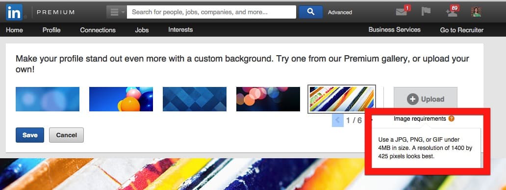
Not following these guidelines can lead to a fuzzy or pixilated image that does not look good. I suggest not having a LinkedIn background image at all if you do not have an image that adheres to the image requirements.
2. Check once. Then, double and triple check.
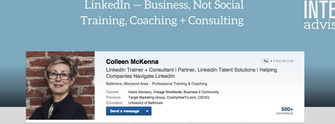
My colleague, Colleen McKenna, was testing out custom LinkedIn background images that included text and thankfully she had her team look at the new image as soon as she uploaded it. Check out the various iterations she had to try before landing on the right one:
First attempt: Left text and right logo cut off.
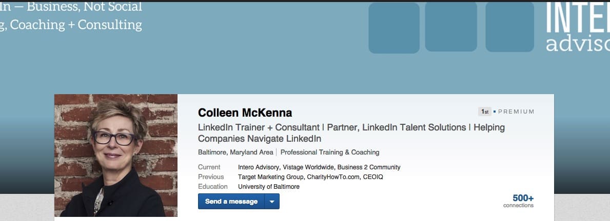
Second attempt: Top text very close to the top and right logo still cut off.
Third attempt: Nailed it.
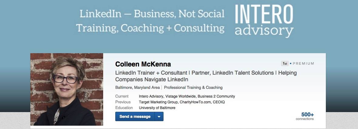
Three tries before arriving at the optimal version. Even when you use the correct dimensions, you still have to consider the image and text itself. Remember: There is (technically) no draft version of your LinkedIn profile. So, as soon as you upload a custom image, have a few of your colleagues look at your Profile on their computers to see if any part of the image or text is being cut off.
We found that if you want to include text, your safest bet is to include it in the top middle portion of your background image. Even then, be mindful that the text does not get cut off at the top.
Thus, check once, double check, and then triple check your custom uploaded background image.
3. Use an outside application.
Our team loves Canva. There are many tools now that allow you to easily create custom designs. The Intero Team are big fans of this super-simple online application when creating custom images.

There are perks to paying for the tool (like anything though, right?), but even on the free version you can create images with custom dimensions. Remember: 1400 x 425 for your LinkedIn background image.
Side note: I recently started using Canva to create my LinkedIn header/hero image for my published posts.
You work hard enough as it is. Do not make the LinkedIn background image feature more complicated than it needs to be. Use a tool like Canva to make it easier for you.
Personalize your Profile with a custom LinkedIn background image by simply following the custom images requirements, triple-checking your image looks correct, and using an outside tool to make it easier.
Do you have a stellar LinkedIn background image? Leave a comment below. We would love to check it out.


